Home › Guides › How to color grade photos on your phone
How to Color Grade Photos on Your Phone
Short answer: Color grading is the craft of shaping the colors and tones in a photo on purpose. On your phone you do it with four tools — white balance, tone curves, HSL, and color wheels. Get exposure and white balance right first, then use curves for contrast, HSL to fix specific colors, and the wheels to add mood. This guide is your map; each tool links to a deeper walk-through.
"Color grading" sounds like something reserved for movie colorists in dark rooms, but it just means deciding how the color in a photo should feel — warmer or cooler, richer or more muted, moody or clean — and then steering it there deliberately. The tools that do this once lived only on desktop software. Today the same controls fit in your pocket, and once you understand what each one is for, they stop being intimidating.
This is the overview page. It explains the four core tools, gives you a repeatable order to use them in, and points to focused guides for each. Read it top to bottom the first time, then bookmark it as a checklist.
Color correction vs. color grading
These two terms get mixed up. Color correction is fixing what's wrong: a photo that's too blue, too dark, or off-balance. The goal is neutral and accurate. Color grading is the creative step that comes after — adding a mood the scene didn't literally have, like a teal-and-orange cinematic feel or a warm faded film tone. Correct first so you're grading from a clean, honest base; grade second to give the image a point of view.
The four tools that do the work
Almost every color decision comes down to four controls. Each one answers a different question.
1. White balance — "what should count as neutral?"
White balance sets the temperature (blue ↔ yellow) and tint (green ↔ magenta) of the whole image. It's how you make white things actually look white — or, creatively, how you push a scene warmer at sunset. This is almost always the first thing to touch, because every other adjustment depends on it. See white balance and color temperature basics for the full explanation.
2. Tone curves — "how bright, and how much contrast?"
A tone curve maps input brightness to output brightness. Pull it into a gentle S and you add contrast; lift the bottom-left point and you fade the blacks for that soft, matte film look. Curves also work per color channel, so you can tint the shadows and highlights independently. Start with tone curves for beginners if this is new.
3. HSL — "fix one specific color."
HSL breaks the image into color bands (reds, oranges, greens, blues, and so on) and lets you change the Hue, Saturation, and Luminance of each one on its own. It's the surgical tool: nudge the orange band to correct skin, calm an overpowering green, or deepen a blue sky without touching anything else. The HSL guide for skin tones covers the moves you'll use most.
4. Color wheels — "add mood to shadows, midtones, and highlights."
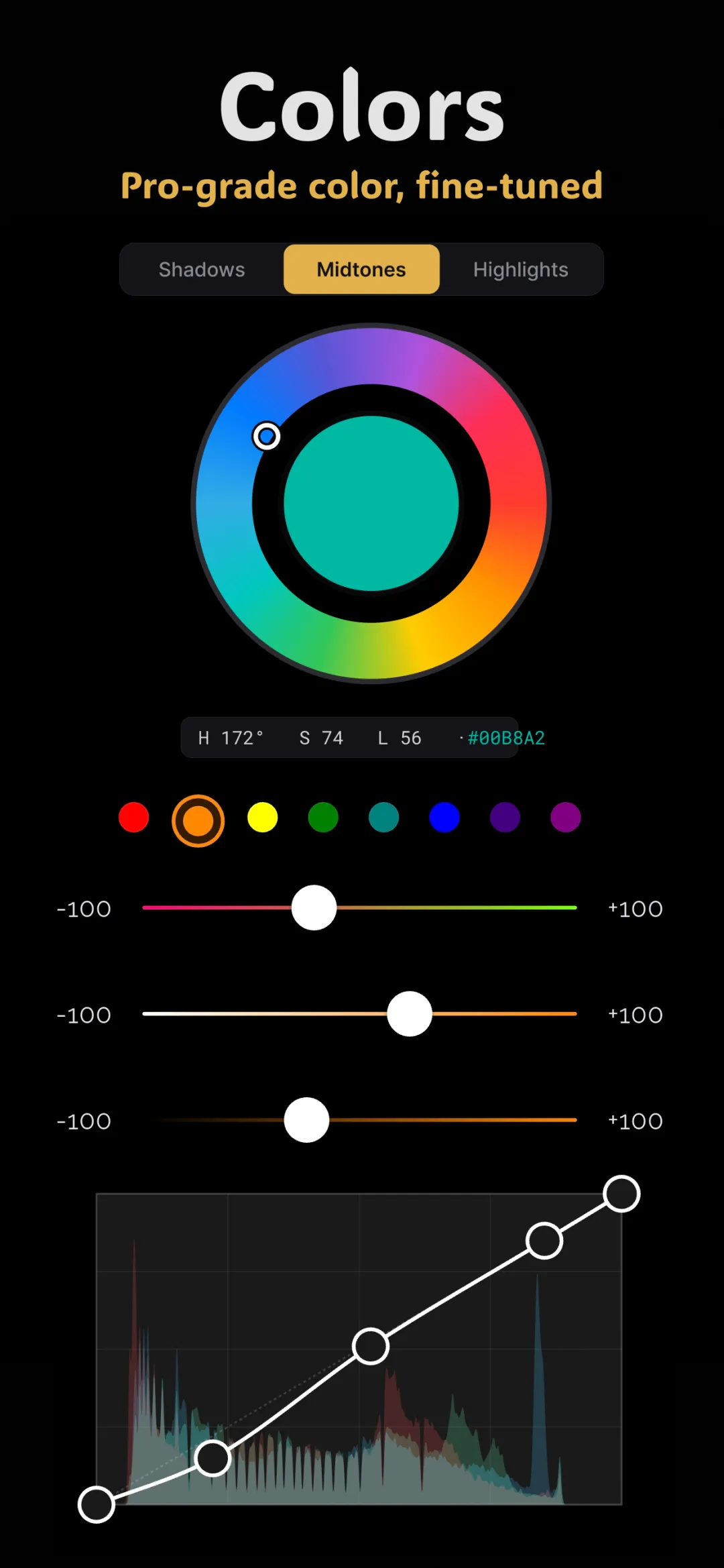
Color wheels (the lift-gamma-gain approach) let you push color into three tonal ranges independently: shadows, midtones, and highlights. This is where cinematic grades are built — cool shadows, warm highlights, a controlled overall tint. Learn how they split the image in color wheels explained.
A simple workflow you can repeat
Order matters. Working in a consistent sequence keeps you from fighting your own earlier changes.
- Step 1 — Expose. Get overall brightness right first. Grading a photo that's too dark or blown out just amplifies the problem.
- Step 2 — Balance. Set white balance so neutrals look neutral. Now your colors are honest and everything downstream behaves predictably.
- Step 3 — Contrast. Shape the tone curve. Add an S-curve for punch, or lift the black point for a faded look. This defines the image's "weight."
- Step 4 — Fix colors. Use HSL to correct anything specific — skin that's too orange, grass that's too electric, a sky that's too pale.
- Step 5 — Grade for mood. Reach for the color wheels last. Push the shadows and highlights toward the feeling you want. This is the creative layer.
- Step 6 — Finish. Add grain or halation if you want a film texture, and dial the whole effect back a touch so it feels natural rather than heavy.
Why editing a RAW file matters
Color grading pushes pixels hard, and cheap 8-bit files fight back with banding — those ugly stripes in a smooth sky. Working from a true 16-bit RAW develop gives each gradient far more steps to work with, so big color and contrast moves stay smooth. If you shoot RAW, start there. Our guide on how to develop RAW photos on your phone explains why the extra bit depth is worth it.
Grading in Fimii
Fimii puts all four tools in one non-destructive panel: white balance with temperature and tint, RGB and per-channel tone curves, HSL across every color band, and lift-gamma-gain color wheels for shadows, midtones, and highlights. Because it develops in true 16-bit, the grades stay clean even when you push them. And if you'd rather start from a look and refine it, Fimii's handcrafted film presets are just recipes built from these same controls — you can apply one and then open any slider to make it yours.
There's also an AI look-match that studies a reference photo and tunes these sliders to match its colors. It never repaints or fakes your image — it only sets the same controls you'd set by hand, which makes it genuinely useful for matching colors between two photos.
The one grade worth learning first
If you want a single result that teaches you everything, build a teal and orange cinematic grade. It uses all four tools together — balance, curve, HSL, and wheels — so once you can do it, the rest of color grading feels familiar.
Fimii gives you pro color wheels, HSL, tone curves and true 16-bit RAW — the full grading toolkit, in your pocket, with no subscription.
Get Fimii — free to download