Home › Guides › Tone curves for beginners
Tone Curves for Beginners
Short answer: A tone curve is a graph that maps how bright a value is before editing to how bright it becomes after. Bend it into an S for contrast, lift the bottom-left corner to fade the blacks for a matte film look, and use per-channel curves to tint shadows and highlights with color.
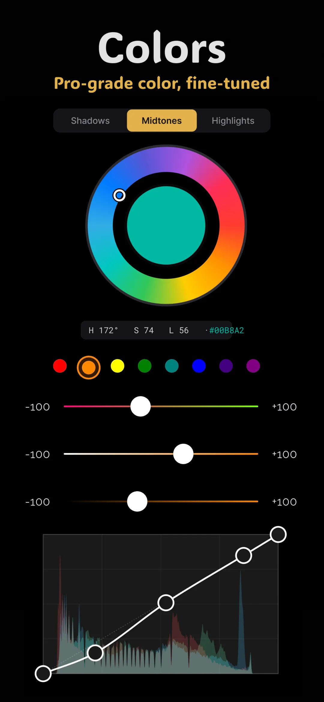
The tone curve looks like a math exam, so a lot of people avoid it. That's a shame, because it's the most powerful single control in any editor and it's genuinely easy once you understand what the graph shows. It's a cornerstone of color grading photos on your phone.
How to read the curve
Picture a square box with a diagonal line running from the bottom-left corner to the top-right. That diagonal is your untouched photo — input equals output, nothing changed.
- The horizontal axis is the input: how bright a pixel is now. Dark values on the left, bright values on the right.
- The vertical axis is the output: how bright that same pixel becomes after the curve.
- The bottom-left corner is pure black; the top-right corner is pure white. The middle is the midtones.
To edit, you drag points on the line. Push a point up and those values get brighter; push it down and they get darker. That's the entire concept. Everything below is just where you push.
The contrast S-curve
Contrast means making darks darker and brights brighter. On a curve, that's an S shape:
- Add a point in the lower quarter of the line and pull it down — the shadows deepen.
- Add a point in the upper quarter and pull it up — the highlights brighten.
- Leave the middle roughly where it is so skin and midtones stay put.
A gentle S adds punch and dimension. A steep S adds drama but crushes detail in the extremes, so ease into it. The beauty of the S-curve is control: you decide exactly where the contrast lands instead of dragging a blunt "contrast" slider that hits everything equally.
The faded-film matte look
This is the signature move behind that soft, nostalgic film feel. Instead of letting the darkest parts of the photo hit pure black, you lift them so the shadows become a muted charcoal.
- Grab the bottom-left point of the curve — the one sitting in the black corner.
- Drag it straight up a small amount. The blacks are now "raised," and the image takes on a hazy, matte quality.
- Optionally pull the top-right point down slightly to soften the whites too, for an even flatter, dreamier look.
This is precisely what film stocks did — they couldn't reach true black — which is why lifting the black point instantly reads as "filmic." It pairs beautifully with the handcrafted film presets in Fimii, and many of them use this exact move.
Per-channel curves: color, not just brightness
Beyond the master RGB curve, you get a separate curve for the Red, Green, and Blue channels. These let you add color to specific tonal ranges, and understanding one rule unlocks all of them: on each channel, lifting adds that color and lowering adds its opposite.
- Red channel: up adds red, down adds cyan.
- Green channel: up adds green, down adds magenta.
- Blue channel: up adds blue, down adds yellow.
A classic filmic split-tone
Try this on the Blue channel: lift the bottom-left (shadow) point to push blue into the shadows, and pull the top-right (highlight) point down to add yellow to the highlights. You've just made cool shadows and warm highlights — the same relationship behind the teal and orange cinematic grade, built entirely with one curve.
Curves vs. white balance vs. wheels
Curves overlap with other tools, so it helps to know when to reach for which. Use white balance to fix an overall color cast across the whole image. Use the color wheels when you'd rather drag a dot than shape a line. Reach for curves when you want the finest control over exactly which brightness values change and by how much — it's the scalpel of tone and color.
Doing it in Fimii
Fimii gives you both a master RGB tone curve and independent Red, Green, and Blue curves. Because it develops in true 16-bit — including from RAW files — steep curves and lifted blacks stay perfectly smooth, with none of the banding that ruins skies when you push an 8-bit JPEG. Every curve is non-destructive, so you can reset a channel with a tap and keep experimenting.
Beginner mistakes to avoid
- Too steep an S. Crushed shadows and blown highlights lose detail you can't get back.
- Moving the middle when adding contrast. Keep midtone brightness stable so skin doesn't shift.
- Forgetting which channel adds what. Remember: up adds the channel's color, down adds its complement.
Fimii's RGB and per-channel tone curves run on true 16-bit RAW — so contrast and faded looks stay clean and band-free. Free to download, one-time unlock, no subscription.
Get Fimii — free to download