Home › Guides › Color wheels explained
Color Wheels Explained: Shadows, Midtones, Highlights
Short answer: Color wheels let you push color into three brightness ranges of a photo independently — the shadows, the midtones, and the highlights. This is the "lift, gamma, gain" model. Cool the shadows, warm the highlights, and you have the backbone of almost every cinematic grade.
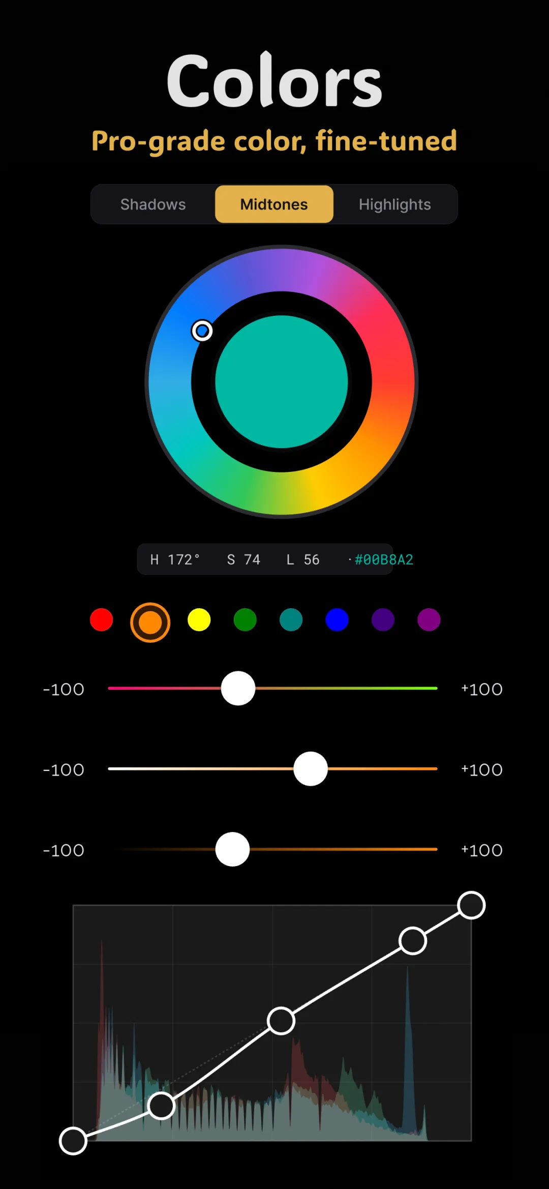
Color wheels look complicated the first time you meet them — three circles, each with a dot you drag around. But the idea behind them is simple, and once it clicks you'll reach for them constantly. They are the tool colorists use to give a scene its mood, and they're a core part of color grading photos on your phone.
The one idea to understand: three tonal ranges
Every photo can be split by brightness into three zones. The dark parts are the shadows. The bright parts are the highlights. Everything in between — skin, most surfaces, the bulk of the image — is the midtones. A color wheel is assigned to each zone, so you can tint the darks one color and the brights another without them bleeding into each other.
That separation is the whole point. Adding warmth to the entire image just makes it look orange. Adding warmth to only the highlights while cooling only the shadows creates depth and contrast between colors — the thing our eyes read as "cinematic."
Lift, gamma, gain — the same three wheels, named properly
You'll see the terms "lift, gamma, gain" a lot. They're just the technical names for the three wheels, and each affects its zone in a slightly different mathematical way.
- Lift controls the shadows. It raises or lowers the darkest values and tints them. Nudging lift also sets your black point, which is how faded-film looks are made.
- Gamma controls the midtones. It pivots the middle of the tonal range, leaving pure black and pure white mostly alone. This is where skin tones live, so it's the gentlest, most-used wheel.
- Gain controls the highlights. It scales the brightest values and tints them. Warm gain gives you that golden glow in the bright areas.
In plain terms: lift = dark end, gamma = the middle, gain = the bright end. Two things happen at each wheel — you can shift its brightness (with the ring or a luminance slider) and its color (by dragging the dot toward a hue).
How to read the wheel itself
The circle is a color map: red toward one edge, blue toward another, green somewhere else, with cyan, magenta, and yellow filling the gaps. The center is neutral — no color added. Drag the dot a little way toward a hue and that zone picks up a hint of it. The further you drag, the stronger the tint. Small moves are almost always better than large ones; color wheels reward restraint.
Complementary pairs do the heavy lifting
Colors opposite each other on the wheel are complementary: blue and orange, teal and red, green and magenta. Grades feel balanced when you push two zones toward complementary hues — for example, shadows toward teal and highlights toward orange. That contrast is exactly why the teal and orange cinematic grade is so popular.
A worked example: warm, filmic portrait
- Highlights (gain): drag slightly toward orange/yellow. The bright side of the face and the background glow warm.
- Shadows (lift): drag a touch toward blue or teal. The dark side of the face and the shadows gain depth and stop looking muddy.
- Midtones (gamma): leave close to neutral, or add the faintest warmth. Overdoing the midtones is what makes skin look sunburned.
That's three small drags. The result already reads as a deliberate, moody grade rather than an untouched snapshot.
Wheels vs. curves vs. HSL — when to use which
Color wheels aren't the only way to move color, and knowing their lane keeps your edits clean.
- Color wheels tint by brightness — great for mood, atmosphere, and split toning shadows against highlights.
- Tone curves also work by brightness and can tint per channel, but they're better for precise contrast shaping. See tone curves for beginners.
- HSL tints by color — the right choice when you want to change one hue (like skin or sky) wherever it appears. See HSL for skin tones.
A good grade often uses all three: wheels for the overall feeling, curves for contrast, HSL to fix the one color the wheels threw off.
Doing it in Fimii
Fimii's color grading panel gives you true shadow, midtone, and highlight wheels in the lift-gamma-gain style, so you can split-tone exactly as described above. Because Fimii develops in true 16-bit — including from RAW files — the tints stay smooth even when you push a zone hard, with no banding creeping into skies or skin. Everything is non-destructive, so you can drag a dot back to center at any time. Many of Fimii's handcrafted film presets lean on these same wheels, and you can open the panel after applying one to see and adjust exactly how the shadows and highlights were tinted.
Common mistakes
- Dragging too far. Big moves look like a mistake, not a grade. Keep dots near center.
- Tinting the midtones heavily. Skin lives here; strong midtone color reads as a wrong-looking complexion.
- Ignoring balance. If you warm one zone, consider cooling another. Push in one direction everywhere and you've just recolored the whole photo.
Fimii gives you real shadow, midtone and highlight color wheels — with 16-bit RAW under the hood so every tint stays clean. No subscription, ever.
Get Fimii — free to download