Home › Guides › White balance & color temperature basics
White Balance & Color Temperature Basics
Short answer: White balance sets what counts as neutral in your photo. Two sliders do the work: temperature moves the image between blue and yellow, and tint moves it between green and magenta. Get white things looking white to fix a color cast — or push warmer on purpose for mood.
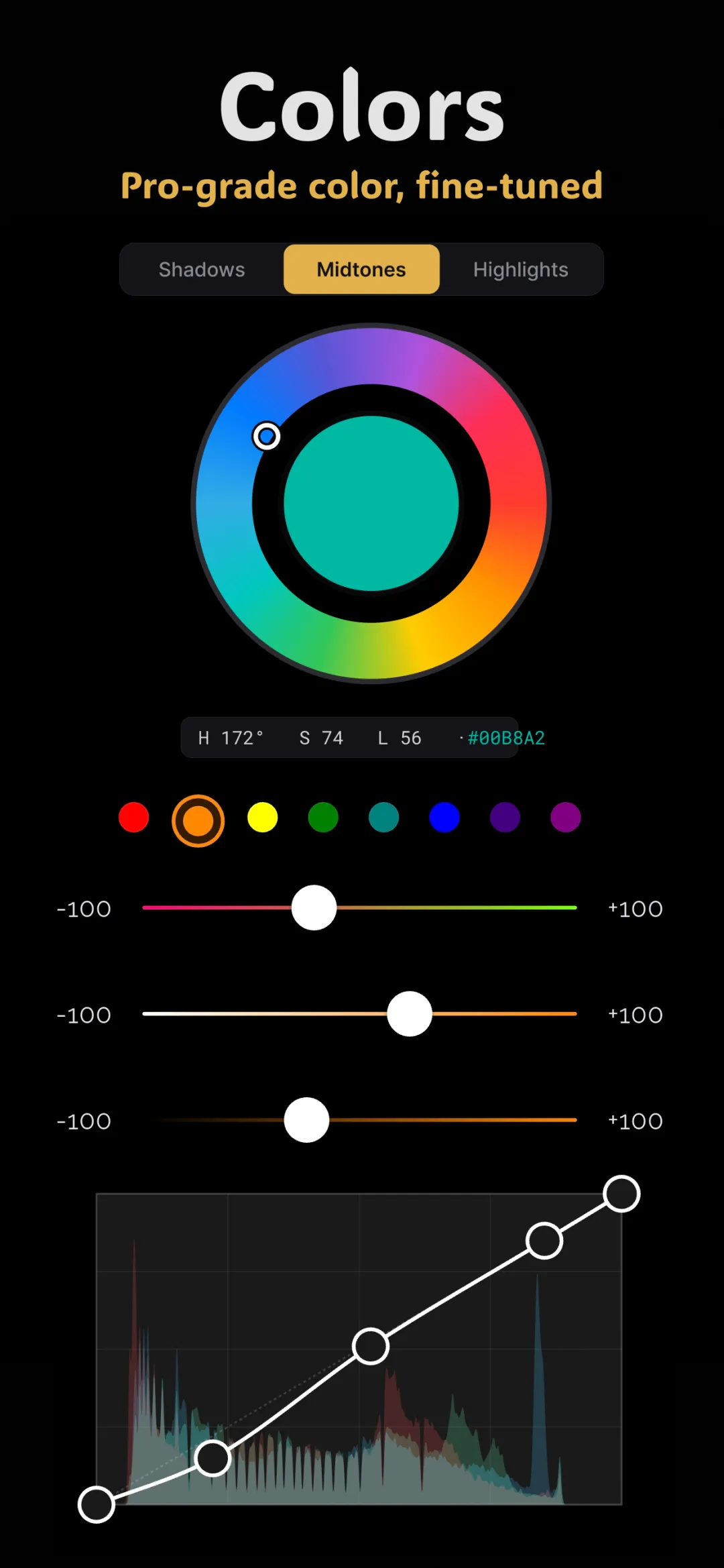
White balance is the first slider you should touch on almost any photo, because everything else you do to color assumes a sensible starting point. Get it wrong and skin goes orange or blue; get it right and the rest of your color grading on your phone falls into place.
Why photos come out the wrong color
Light has a color, even when your eyes don't notice. A candle is deeply orange, midday sun is fairly neutral, and open shade under a blue sky is distinctly cool. Your brain auto-corrects so a white shirt looks white everywhere — but a camera records the light as it actually is. That's why an indoor photo can look orange or a snowy scene can look blue. White balance is how you tell the editor, "make this neutral again."
Color temperature: the blue-to-yellow axis
Temperature is measured in Kelvin (K), and this is the part that feels backwards at first.
- Low Kelvin light (candles, tungsten bulbs, ~2000–3000K) is warm and orange.
- High Kelvin light (shade, overcast sky, ~7000–10000K) is cool and blue.
The counter-intuitive bit: to correct a photo, you move the slider toward the opposite of the light. A photo shot under warm bulbs looks too orange, so you drag temperature toward blue to cancel it. A photo shot in cool shade looks too blue, so you drag toward yellow. In most editors the slider is labelled simply — left is cooler/bluer, right is warmer/yellower — so trust your eyes over the number.
Tint: the green-to-magenta axis
Temperature alone can't fix every cast, because some light leans green or magenta rather than blue or orange. That's what the second slider, tint, is for.
- Drag toward green to cancel a magenta/pink cast.
- Drag toward magenta to cancel a green cast — the classic fix for the sickly green of fluorescent office lighting.
Temperature and tint together can neutralize essentially any color cast, because between them they cover both axes of color: blue-yellow and green-magenta.
How to set white balance in practice
- Find something that should be neutral — a white wall, gray pavement, a clean shirt.
- Adjust temperature until that neutral object looks neither orange nor blue.
- Adjust tint until it looks neither green nor magenta.
- Sanity-check skin. Faces are the reference our eyes judge hardest; if the neutral looks right but skin looks off, split the difference.
If your editor has an eyedropper or "auto" white balance, tapping a neutral area gives you a fast starting point you can then fine-tune by hand.
Creative white balance: breaking the rules on purpose
"Correct" is only the baseline. Once neutral, you can deliberately warm or cool a photo for mood — and this is where white balance becomes a creative grading tool, not just a fix.
- Warm it up for golden-hour portraits, cozy interiors, and nostalgic summer scenes. Pushing temperature slightly yellow makes light feel like late afternoon.
- Cool it down for moody streets, blue-hour cityscapes, and a clean, editorial feel.
- Lean into a cast when the light is the story — the orange of a sunset or the blue of dusk is often worth keeping, not correcting.
White balance vs. the other color tools
White balance shifts the whole image along two axes at once, which makes it the blunt-but-fast starting tool. For finer work you'd reach elsewhere: tone curves to tint specific brightness ranges, color wheels to split-tone shadows against highlights, and HSL to fix one specific color like skin. Set white balance first; use the others to refine.
Doing it in Fimii
Fimii gives you dedicated temperature and tint controls as the foundation of its color grading panel. Because it develops in true 16-bit — including straight from RAW files — big white-balance shifts recover cleanly and stay smooth, which is exactly why RAW is so forgiving: the true color of the light isn't baked in yet, so you can rebalance far more aggressively than you can on a JPEG. Everything is non-destructive, so you can rebalance as many times as you like without degrading the photo.
Consistency across a set of photos
White balance is also what keeps a batch of photos feeling like they belong together. Shots taken minutes apart can drift — a cloud passes, you step into shade — and the color temperature shifts with the light. Pick one photo as your reference, balance it well, then match the others to it rather than balancing each in isolation. This is the first and most important step whenever you match colors between two photos, because a temperature mismatch is the single most common reason two images clash.
Common mistakes
- Judging on a color-shifted screen. Turn off your phone's night/warm display mode before balancing, or you'll over-correct.
- Correcting away the mood. Not every warm photo is broken — sometimes the warmth is the point.
- Forgetting tint. If a photo still looks "off" after temperature, it's almost always a green or magenta cast that only tint can fix.
Fimii's temperature and tint controls run on true 16-bit RAW, so even big white-balance corrections stay clean and natural. Free to download, no subscription.
Get Fimii — free to download