Home › Guides › How to match colors between two photos
How to Match Colors Between Two Photos
Short answer: To make two photos share the same colors, match them in order — exposure, white balance, contrast, then specific colors with HSL. Or let Fimii's AI look-match study a reference photo and set those same sliders for you. It tunes controls; it never repaints or fakes the image.
Anyone who posts photos in sets runs into this: two shots from the same moment look like they came from different cameras. One's warmer, one's flatter, and side by side they clash. Matching colors is the fix — and it's also how you copy a look you love from a reference image onto your own photo. It draws on every tool in mobile color grading.
What "matching" really means
You're aligning four things between the two images, roughly in this order of impact: overall brightness, white balance, contrast, and individual colors. Nail those four and two photos will feel like siblings, even if the scenes differ. Skip the order and you'll chase your tail — a color that looks wrong is often just a brightness or white-balance difference in disguise.
The manual method, step by step
Decide which photo is your reference (the look you want) and which is the target (the one you'll adjust to match). Then work through these in order.
Step 1 — Match exposure
Get the two photos to the same overall brightness first. Compare a similar area in each — a face, a patch of sky — and raise or lower the target's exposure until they read the same. Everything downstream depends on this, because color perception shifts with brightness.
Step 2 — Match white balance
This is usually the biggest culprit. Using the temperature and tint controls, push the target warmer or cooler until its neutrals match the reference. If the reference feels golden, warm the target; if it's cool and blue, cool the target. Watch a neutral object in both — white, gray, or skin — as your guide.
Step 3 — Match contrast
Compare how deep the blacks and how bright the whites are. Use the tone curve to match them: add or reduce an S-curve so the two images have the same "punch," and match the black point — if the reference has a faded, lifted-black film look, lift the target's blacks the same amount.
Step 4 — Match specific colors with HSL
Now fine-tune individual colors with HSL. If the reference's skin is warmer, nudge the target's orange band to match. If its greens are more muted or its sky is deeper, align those bands too. This is the polishing pass that makes the match convincing rather than approximate.
Step 5 — Match mood with the wheels
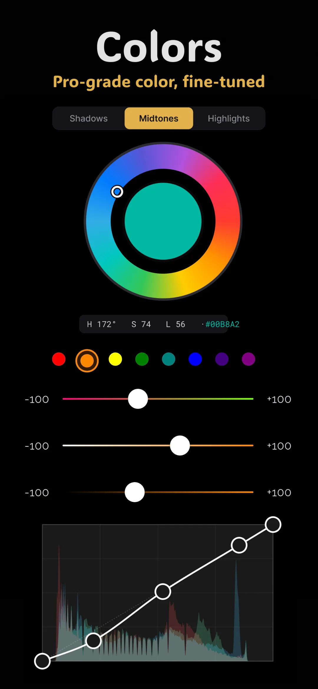
If the reference has a distinct tint in the shadows or highlights — cool shadows, warm highlights — recreate it with the color wheels. This is what locks in a shared "grade" across both images.
The faster way: AI look-match
Doing all of that by eye takes practice. Fimii's AI look-match shortcuts it. You give it a reference photo, and it analyzes that image's color and tone, then tunes Fimii's own sliders — white balance, curves, HSL, wheels — so your photo takes on the same look.
The critical distinction: it never repaints, generates, or fakes your image. It doesn't draw new pixels or hallucinate content. It only sets the same real controls a colorist would set by hand, which means the result is honest, editable, and yours to refine. Every slider it moved is visible, so you can open the panel and adjust anything it got slightly off. That makes it ideal both for matching two of your own photos and for borrowing the color feel of an image you admire.
Why "tuning sliders" beats "repainting"
- It stays truthful. Your subject, textures, and details are untouched — only color and tone shift.
- It stays editable. Because it's just slider values, nothing is baked in. Dial any adjustment up or down afterward.
- It stays clean. Running on true 16-bit — including developed RAW — the matched grade is smooth and band-free.
Tips for a believable match
- Match brightness before color, always. Most "color" mismatches vanish once exposure agrees.
- Use skin as your anchor when both photos have people — our eyes judge skin hardest.
- Don't force impossible matches. A shot in shade and a shot in direct sun can be brought close, but not made identical. Aim for "same family," not "same photo."
- Save the result as a starting point. Once you've matched a look you love, keep it as a recipe to reuse across a whole set.
Matching a whole set
For a batch that should feel cohesive, match every photo to one reference rather than to each other — a single anchor keeps the set from drifting. This is also the logic behind using consistent film presets: applying one recipe across many shots gives an instantly unified, intentional feed.
Fimii's AI look-match copies the colors of any reference photo by tuning real sliders — never repainting your image — with clean 16-bit results. Free to download.
Get Fimii — free to download