Home › Guides › The teal & orange cinematic grade
The Teal & Orange Cinematic Grade
Short answer: Teal and orange is the most recognizable "movie" look because skin is already orange, and pushing the shadows toward teal — its complement — makes people pop off a cool background. You build it by warming skin, cooling shadows with the color wheels, and cleaning up with HSL.
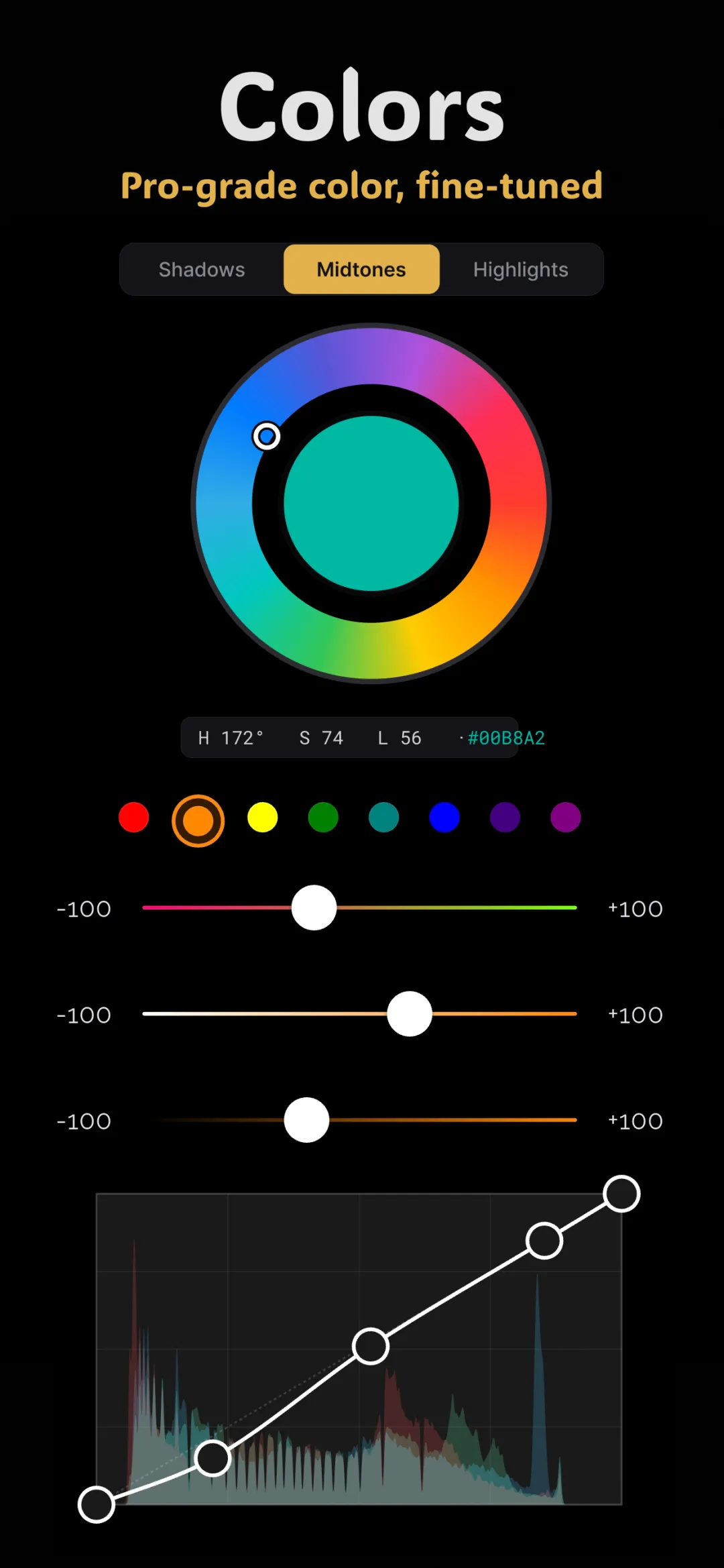
You've seen this grade a thousand times — in action blockbusters, travel films, and half your favorite Instagram accounts. Warm orange skin against cool teal shadows. It's popular for a good reason rooted in color theory, and it's one of the most satisfying grades to build once you know the core color grading tools.
Why teal and orange works
The secret is complementary contrast. On the color wheel, orange and teal sit almost directly opposite each other. Complementary colors create the strongest visual contrast possible, so when you place them side by side each looks more vivid.
Now the clever part: human skin is already orange (it lives in the orange band, as covered in the HSL guide). So if you push everything that isn't skin — the shadows, the background, the cool areas — toward teal, your subject separates from the scene and jumps forward. Filmmakers adopted it because it makes actors stand out from any environment with almost no effort. That's the whole trick.
Before you start: a clean base
A cinematic grade sits on top of a well-prepared photo. Do two things first:
- Fix exposure so the image isn't too dark or blown out.
- Set white balance to neutral, following the white balance basics. You want an honest starting point before you deliberately push colors around.
Step-by-step with color wheels and HSL
Step 1 — Cool the shadows with the color wheels
Open the color wheels and go to the shadow wheel (lift). Drag its dot a small distance toward teal — that's the blue-green region between cyan and blue. The dark areas and background take on a cool cast. Keep it subtle; a little teal reads as cinematic, a lot reads as broken.
Step 2 — Warm the highlights
Move to the highlight wheel (gain) and nudge it toward orange. This warms the bright side of faces and any light sources, reinforcing the orange half of the contrast. You now have the fundamental split: cool darks, warm brights.
Step 3 — Protect the midtones (and skin)
Leave the midtone wheel (gamma) close to neutral, or add only the faintest warmth. Skin lives here, and heavy midtone color is what turns a grade into a mistake. The goal is teal around your subject, not on their face.
Step 4 — Perfect skin with HSL
Open HSL and work the orange band. If the wheels pushed skin cool, warm the orange hue back toward red and lift its luminance a touch so complexions stay healthy and bright. This is the step that separates a professional teal-and-orange look from a cheap filter — the shadows are teal, but the people still look like people.
Step 5 — Deepen the teal in the background
Still in HSL, if the scene has blues or aquas (sky, water, shade), nudge those bands' hue toward teal and lower their luminance slightly. This concentrates the cool color where it belongs and strengthens the separation without touching skin.
Step 6 — Add contrast and finish
Drop a gentle S-curve on the tone curve for depth. If you want a filmic feel, lift the black point slightly for a matte finish, then add a whisper of grain. Finally, pull the whole effect back if it looks heavy — restraint is what makes it look intentional.
Where teal and orange works best
- Portraits with a cool background — shade, blue hour, water, or a dark interior.
- Travel and street scenes with warm subjects against cooler surroundings.
- Golden-hour shots, where the warm light already does half the work.
It works less well on scenes with no warm subject at all — a snowy landscape has nothing to be the "orange," so the contrast never appears.
Doing it in Fimii
Fimii has everything this grade needs in one non-destructive panel: lift-gamma-gain color wheels for the teal-shadow / orange-highlight split, full HSL to protect skin and deepen the background, and tone curves for contrast. Because it develops in true 16-bit — including from RAW files — pushing the shadows teal stays smooth with no banding in dark, gradient areas where cheap edits fall apart. Prefer a shortcut? Several of Fimii's handcrafted film presets land in cinematic territory, and you can open the wheels afterward to fine-tune the exact teal and orange balance. For more on the broader look, see our guide to the cinematic photo look.
Common mistakes to avoid
- Turning skin teal. The number one giveaway of an amateur grade. Protect the orange band in HSL so the cool cast lands on the background, not the face.
- Overdoing the wheels. Big drags make the image look tinted rather than graded. Small moves on the shadow and highlight wheels are all you need.
- Applying it to every photo. The look thrives on a warm subject against cool surroundings. Force it onto a scene with no warm element and it just looks muddy.
- Skipping white balance. Grading on an uncorrected photo means you're fighting an existing cast. Neutralize first, then push toward teal and orange on purpose.
Build a true teal and orange grade in Fimii with real color wheels, HSL and 16-bit RAW — clean shadows, natural skin, no subscription.
Get Fimii — free to download